Rock Paper Scissors

Well-designed websites are a good thing. I've surfed my fingers to the bone over the past few years, only to find that most websites I come across are either too flashy, wordy, boring, noisy (eek!), ugly, bare, unprofessional, ad-based, or pop-up insane. I know it's hard to build a website, not to mention expensive and a big burden to maintain, so my heart goes out to those that require one to build a business. I have to give props to all that do invest in a good web presence. When I do come across sites that are designed well on all levels, I instantly bookmark them and return again and again. I guess it gets back to the Blueprint discussion we had earlier. If something is well designed, it attracts attention, even if you're not exactly sure what it is about it that lures you in the first place.
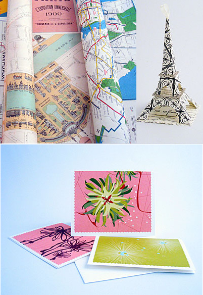
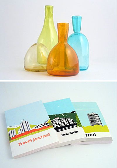
I think we should have a little 'best website' shout out. I'd love it if you'd cast your votes. I'm talking about content, usability, beauty... I'd like to see how you define a well designed website. I already have some in mind, but for now, I'll refrain from my list and just share one that I'm voting as a top 10 site. Hands down, Rock Paper Scissors designed by genius design studio Breviloquent, totally rocks. I'm not a fan of the sound they have on their home page because people do surf when they should be working and man it's scary and embarrassing when you forget to turn off the sound and loud music or other misc. sounds start streaming out of your computer. Busted! But, outside of the typing sounds (I like them but again, a web designer has to think about people who surf on the job), Rock Paper Scissors has a clean modern vibe that I'm totally feeling. They're easy to navigate and have some fabulous product shots.
If anyone is reading this and has a website of their own, I have one pleading suggestion. If you have a website as well as a brick and mortar store, pahleeese put photos of the interior and exterior of your storefront somewhere on your website, preferably under location or contact. I can't tell you how much consumers appreciate seeing a store in advance. It also helps me to identify it when I'm driving down the street with a big map in hand.
What are your favorite well-designed websites?
(images from rock paper scissors)
