Design Star Dish with Becky
Here's the weekly Design Star Dish with Becky Harris... The stage is all yours, Miss Becky!- Holly
Hi Design Star Watchers! Well, let's face it -- it was schmaltzy. It was one long ad for Lumber Liquidators and Kenmore's Elite Line; even Vern had to throw in a scripted admiration for the appliances. However, it got to me. I'm so glad Design Star did something useful and helped two families who lost everything in Hurricane Katrina. I'm also glad to see attention brought to the people who are still suffering almost three years later. It was so nice to hear those New Orleans accents on the homeowners as well - if that's not the greatest U.S. accent, I don't know what is!
Did anyone happen to catch what their budgets were? I missed that part, but figured they were high when Matt bought a $1700 light fixture. Overall, I really like both Matt and Jen. They both seem like sincerely nice people with great energy. I tried hard to look at this challenge in terms of the needs of the families and not in terms of high design.
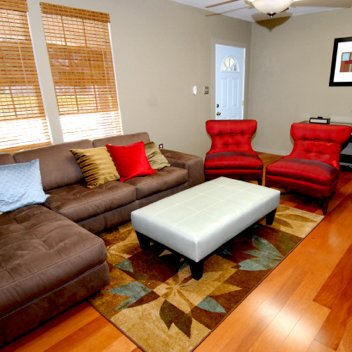 Matt's Room
However, as Nina Garcia would say, I think Matt's problem is a taste issue. He's great for infrastructure, carpentry, and solutions, but I don't think he knows anything about color theory or space planning, and he put tchotchke Buddhas in front of the flat screen. His blinds were ugly and didn't go with anything, the rug, furniture and throw pillows were completely mis-matched, and the color of the kitchen cabinets was dreadful.
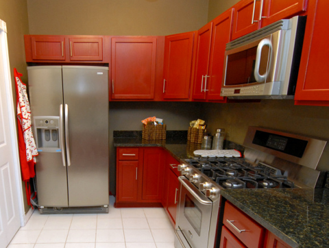 Jen's Kitchen
Jen's design was a bit dated but pleasing. One thing I don't understand - if you have to throw together a kitchen in a hurry on a budget, why not go to IKEA? I'm having a deja-vu, I think someone here may have said that during the kitchen challenge! They have those awesome red glossy kitchen cabinets there, and it only takes an hour for someone in the store to lay the whole thing out for you. I thought her kitchen turned out fine though. The horizontal striped painting is very Laurie of Trading Spaces circa 2001, or Tom Filicia of Queer Eye circa 2003, but it looked fine and the family loved it. While the couch turned out to be a bit of a space planning flop, the whole family was able to flop on it at the same time.
It's kind of hard to criticize when the outcome was so appreciated and needed. I think the thing that stood out the most were Trish's amazing abs. The second biggest standout was Cynthia's darling dress. I simply cannot think up anything else, mostly because I am DYING to go watch the new episode of Mad Men! I can't wait to see those sets and costumes in HD!
So OK, back to Design Star...
What did you all think of the designs? Who will you vote for and why? Who is a better host? Did any particular element of either design hit on one of your pet peeves? Have you ever tried to paint a room red, and if so, how did it go? - Becky
(images from hgtv)