Spool Design {& 5 tips for a better shop}
I really like jewelry shop Spool Design, a pretty place that I stumbled upon yesterday owned by Alison, a graphic designer living and working in Delaware. I like this shop for more than the obvious, feminine jewelry, and I’d love to highlight a few reasons because some of you may benefit by reading this if you own a small online store selling jewelry (or anything else for that matter).
1. Thoughtful item descriptions. For one, the dainty finds are so sweet… if I had a daughter I’d scoop up these owl earrings for her in a second. I also like Spool Design because she gives each creation a beautiful name and going a bit further, writes a charming story as the item description. Not everyone can and should do this, but it’s nice that Allison found a way to make her products stand out in such an original way. You can talk about the inspiration behind the piece, where you found the materials (a trip to Morocco, a local flea market, etc.), why you love the piece. It can be one simple sentence but often it’s that personal bit that really attracts me to a piece. Here is an example of the story behind the owl earrings shown above as told by Spool Design.
“Every evening, just after dusk, Miss Olivia sits high on her branch, ready to gab with any passerby that is willing to listen. Since Ralph flew the coop, she has kept each of her thoughts to herself about what she thinks of Lorraine’s new boyfriend, some of the new customers at Farrina’s Feather Fluff Salon and how easy her new recipe for sugarberrie pie is. “Oh! How grand…looks like Betsy is grazing her way over here! Her new rouge looks absolutely splendid…Oh Betsy…” - Allison, Spool Design.
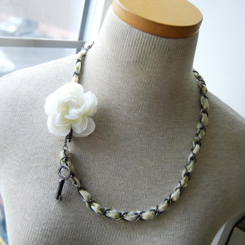
2. Another thing I love is that Spool Design has a cohesive collection, everything works together, there’s a theme and feeling to it. It’s important when you open a shop to have a vision and to carry that vision through from the shop name to the props in the photographs that you choose, colors, and so on. It really makes you stand out as a seller. I like how easy it is on the eyes, you open her shop and immediately feel like this girl has style and vision - it’s quite welcoming vs. something very chaotic.
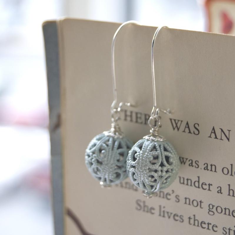
3. The photography at Spool Design is thoughtful, she obviously spends time thinking of how she’ll style her pieces and then she makes sure to shoot them in daylight so that their natural color is apparent. If you are a jewelry artist using a flash camera rethink that because you will lose significant sales with photos that aren’t doing your beautiful work justice with amateur flash photography (note: if you’re a pro this sentence does not apply obviously). I have purchased jewelry photographed using a flash and the colors were all wrong for my outfit when they arrived in the mail. I was deeply disappointed.
4. Allison has some great props. What props can you use? If you are doing close up shots you can find beautiful large squares of scrapbook paper or even matte gift wrap to photograph against. You can tape it to the wall behind the item or you can place it below the item. You can also use natural linen, cork, wood, fabric (iron it first), old book pages with text or illustrations, road maps (flatten and iron out creases), wallpaper, the sky is the limit. Get creative! For props, Allison uses a really unique and lovely dress form for her jewelry, not the typical black velvet necks that you see in every shop but a lovely bust she found that appears to be vintage with wood and linen. An old dressmaker’s form works well. I blogged about them and where you can find them a few years ago but I think the post is still very helpful so you can find it right here.
5. Allison also blogs and it looks and feels like her shop so there is no disconnect. It’s light and bright just like her shop so you know you’ve just landed on the seller’s blog and were not redirected elsewhere.
I’m glad that I found Spool Design because simply viewing her shop and the beautiful job that she’s done to give a thoughtful presentation of her work inspired me to write this post and perhaps it will inspire you, if you have a shop, to consider a few of these points to make your shop stand out more, too. In this economy it’s REALLY IMPORTANT to stand out now more than ever, be an original!
Other shops that stand out: les zigouis by Barbara Berrada, Naomi Murrell, Allen Company Inc, Karlita, Acts of Kindness, Lobster&Swan, and SusyJack* come to mind.
Any tips of your own that you’d like to share for shop owners? Things you’ve encountered that you did not like? Things you’ve seen that you loved and would enjoy pointing to as a good example?
(images from spool design)


