Home Office & Living Room Redesign
Ready to see a fresh, modern home office space? How about a living room with lots of pattern for a busy family with pets? Interior Designer Vanessa De Vargas who owns Turquoise, a Los Angeles-based furniture and interior design business wrote in to share a recent project with us and after viewing the space, I thought I’d ask her a few questions and share her answers here today as it’s always fun to get inside the mind of a designer. Let’s check out this office and living space, shall we?
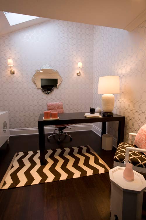
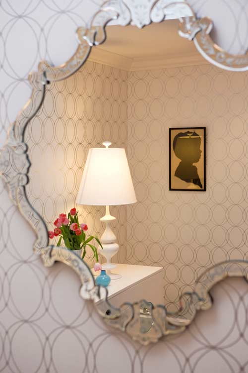
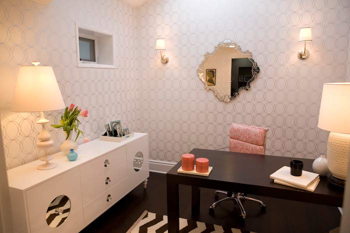
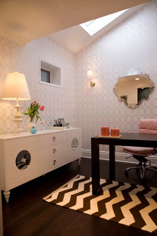 First of all, what inspired this fab office space? First let me say that before I started to decorate the room it was very dark. The walls were dark brown, the desk was dark and there was a dark brown mirror that hung above the desk. When I first met with my client she basically said to me, “Please, I don’t want any dark colors — I want pink accents, a mirrored cabinet, and a Venetian mirror, can we do that?”, and I thought hey, if that’s what you want, lets decorate it that way!
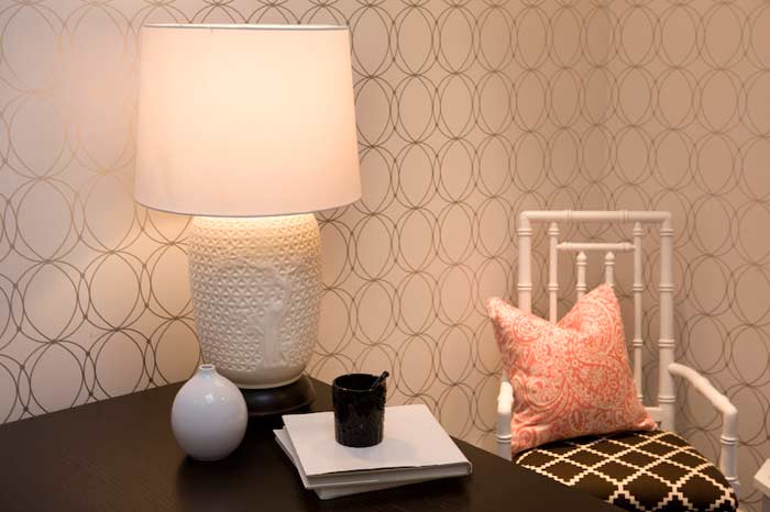
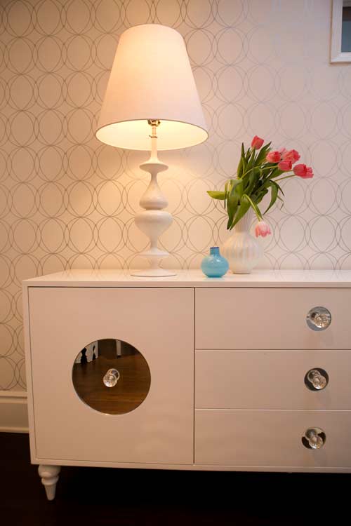 How did you decide on the wallpaper given that there are thousands to choose from on the market these days? I researched tons of papers and when I came across the silver and white circular one, I knew that was it. I honestly didn’t even show her any other wallpapers. So to answer your question my client was the inspiration, she told me what she wanted and based on her wants I then took my design expertise and made the office come to life!
Where did you find a majority of your furnishings and accessories? The desk she already had so that was a newer purchase including the custom cabinet we had made at a local furniture store and the desk chair. The lamp and accessories are from Jonathan Adler and the desk lamp, Moroccan table and bamboo chair (with the Lulu DK Chant fabric) were all re-vamped vintage pieces. The rug was from West Elm.
Is the silhouette on the wall of anyone in particular? No that’s actually a vintage silhouette that she purchased from me.
Where is that amazing task chair from? The chair is a reproduction Eames task chair that we had reupholstered in outdoor paisley fabric from Sunbrella.
Next up, the living room:
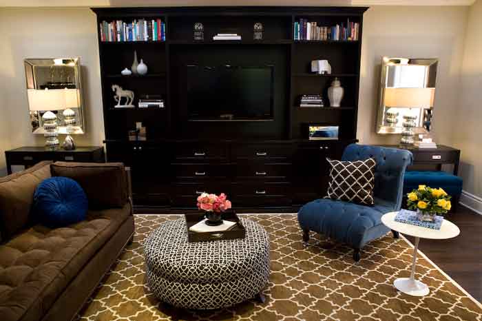
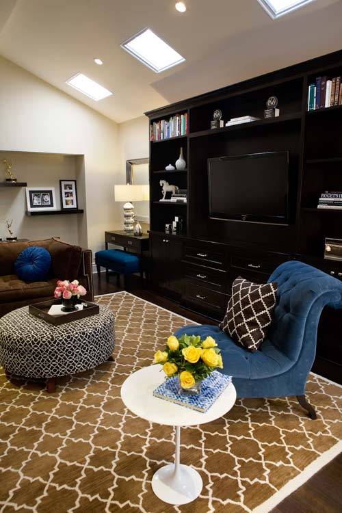
In the living room, what made you go with a neutral, darker palette? The living room is also the TV room. My clients have 3 kids and 2 dogs so I made sure the furniture pieces where either dark in color, had a pattern or were upholstered in outdoor fabrics. They also loved the color royal blue so we incorporated that in the custom tufted chair, custom benches and accent pillows. I also thought that having a nice neutral background (meaning the walls) was a great way to have the furniture pieces pop.
There’s a lot of pattern but it’s subtle, any tips on how to use a lot of pattern in a space without going overboard? That is a good question Holly, this was really the first time I used many different patterns under one space. I think that if you stay in the same size family of each of the patterns and stay consistent in the colors palette, you can use a few patterns at once. I noticed that when I pulled other patterns that were bigger in size they either over powered the look or made it look too busy.
What in this space belongs to the client that you were able to keep in the mix?The only thing that was there was the built in TV unit. Everything was new that we brought in. Including all the accessories on the shelves and the trays in the rooms.
Thanks Vanessa for the show and tell!
Psst: If you’re in the Los Angeles area and would like to network with designers and other creatives, Vanessa leads a popular design pow wow called Designers Networking Group (DNG) which is held monthly giving all a chance to network, enjoy some eats and drinks, and best of all — no charge! Just attend, bring those business cards and enjoy an evening out. More information here.
If you have a questions for Vanessa, please comment below and she’ll stop by to answer, thanks!
(images: vanessa de vargas)
