Richard Powers (+ How I Choose Images)
Richard Powers is an amazing talent that I have to point you to today for interiors and still life eye candy. Based in the UK, Powers is a sought-after pro photographer who shoots for top magazines like Elle Decoration, Livingetc, Dwell, RUM, AD, Elle Decor and many more. He is currently shooting the home of someone I know, but I'm not sure that I am allowed to say who just yet so I may have to tell you later when the article is published. For now you can enjoy some of the views through Powers' lens below..
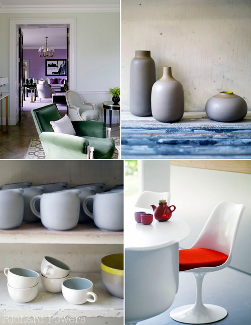
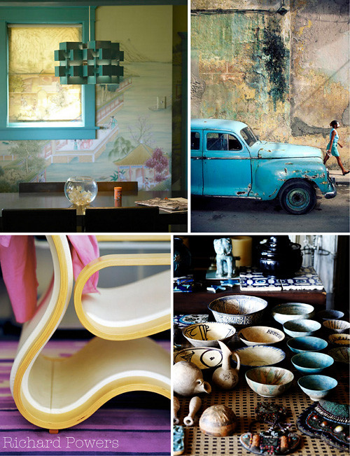
A lot of friends ask me how I choose the images that I show on decor8, what thoughts run through my head as I place photos one by the other... Truth is, it's intuitive and emotional for me so it's hard to explain but I'll try with what I've shown above... Okay, so I selected images above from Powers' portfolio that fit my current mood and also palette, colors that I am inspired by... violet, green, turquoise, a dash of yellow or pink or red. I also tried to show some of my current favorite textures - because texture makes a room you know... rough, soft, smooth, crinkled, torn, silky... I love the mix of high and low, old and new, worn and untouched. I think it's the combination of these things that make better collages when mixing imagery, at least for me. I also like to try to find something in one photo that is also in the one that I want to lay near to it. It could be a color, a texture, a pattern or something less obvious like the way a photo smells to me (yes, smells!) or how it feels (warm, loving, cold, welcoming, sharing, cozy).
Allow me to illustrate...
In the very first grouping, the two images that I have placed a white frame around, I selected them to sit together because the top image is very violet and traditional and bottom image is very modern and graphic with black and white but I loved pairing the two because though they seem to have nothing in common, they do both contain the color purple in very different doses which I think nicely illustrates how violet can work in both large and small doses in a room.
In the next grouping above, I really like the top two side-by-side for no other reason outside of the shapes. In the image on the left, the door and chair look similar in composition to how the ceramics in the right photo are placed. In the bottom two images, I love the idea of having an abundance and having very little -- a lot of dinnerware and then on the table, very little. I also like the worn shelving against the clean, streamlined tulip table and I like how the curves in the china on the shelf mimic the curves in the furniture shown to the right. Another similarity I liked is seeing the handles on many mugs and pitchers and on the table seeing only one handle. Lots of ways we look at things can seem quite abstract, often we think they are not that important because there is no rational, practical explanation behind our thinking, but oftentimes this is the more interesting viewpoint to me - the less obvious, abstract, way-out-in-left-field viewpoint.
And for my final illustration, in the collage above the top two images obviously work well together because of the colors - that strong turquoise is mesmerizing. But more enticed me to pair them side-by-side. I like how in the room, the background is a very soothing scene on wallpaper that is quite muted and serene, and then to the right you have an urban setting with a worn wall that also feels serene and provides for a perfect backdrop. In the bottom two images, I found the curves of the chair very sensual, and strangely enough, I found the collection of bowls sensual as well. I also really like that creamy white in the chair that is also in some of the bowls and how that gorgeous violet in the left hand image works so beautifully with the turquoise found in the photo to its right.
Altogether dreamy.
Do you have any impressions that you'd like to share from these same images above? How do decide how to pair images that you use on your blog? I'm curious to know...
(images: richard powers)


