Explore The Mind of Stylist Meagan Camp
Are you ready to get inside the mind of a professional stylist today? I thought I'd interview the very talented Meagan Camp in Northern California today, but this isn't your typical interview... What I've done is I've selected imagery from her portfolio that she styled and then asked her to explain the thought process behind each shot. I love her answers and think you'll find Ms. Camp most inspiring... so let's get started! 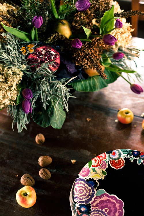
Hi Meagan! Can you tell us how you got into styling? I laugh to admit that it all started with a Barbie “Dream House”! But I do remember intensely studying design books, magazines and catalogs and carefully observing how the items in each image were laid out, lit, and arranged. I had no idea what a stylist was at that time but I was always creating vignettes. As a kid, my bedroom was my design studio and I still vividly remember "casually tossing" a straw hat at the end of my bed over and over again trying to make it look effortless. It wasn't until attending college at the Fashion Institute of Technology in New York that I figured it out. My major was Display and Exhibit Design, but I was most energized while helping classmates prop their photo shoots.
What is the difference between styling and decorating? A Decorator creates spaces that are livable, functional and intended to endure a longer amount of time for specific needs of their client. A Stylist works with a photographer to develop set-ups intended for photography. At times styling can be “smoke-and-mirrors" -- we’re taping, pinning, and rigging items for the photo. That one shot is to create a “moment in time” within a beautiful image and not necessarily for real life.
Do you take photos or only style for them? In addition to Display and Exhibit Design, I also studied Photography at the Fashion Institute of Technology in NYC so that I could learn the technical aspects of the industry -- a huge part of styling is lighting, composition and exposure. But studying photography was only to gain the knowledge of the medium and I never intended to be a photographer. I did have one professor who told me to stop wasting my money and to "go get a book on photography" Nice guy, huh? Having knowledge of the photographic process helps me technically visualize an image and allows me to have an educated conversation with the photographer on what I’m trying to achieve stylistically.
What are you trying to create when styling for Fashion? For Products? For Interiors? I think it’s the same for all projects, to create a visual conversation between the viewer and image. It’s a bit tougher when Product styling because it’s less about a “moment” and more about selling a certain item. But as long as I can get someone to look twice and be intrigued with the image, I’ve done my job!
Can you give some advice to budding stylists to help them get started? My advice is simple: Do now, think later. As artists and visual people, we have a natural tendency to second-guess ourselves and to hold off on putting our work and ourselves out there until just the right moment. You can’t get work unless you have work to show. It’s an evil-circle but you have to start somewhere. Shoot with as many people as you can, work with as many people as you can, and get involved with as many projects as you can. Cold-call emails don’t hurt either!
If someone wants to be a stylist but lives in the most boring town in the world, how can they still begin locally? Should they practice at home? In a local shop doing windows? Thoughts? About a year ago I moved from New York to a small town in Northern California, all the while thinking it was career suicide. If you spoke to me during that time I would have told you that being in a city is crucial to being a stylist, but that may have been the New Yorker inside of me speaking! And you know what? Moving out of a city wasn't career suicide; moving and changing directions in life allowed me to see the world differently and quite possibly gave me another perspective on my work. One of my favorite quotes is Anais Nin's, "We don't see things as they are, we see them as we are," and styling just like any other art, is going to come out of you no matter where you live. We also have the opportunity to benefit from a changing industry with a strong online presence. Having a blog, being on twitter and most importantly, having an online portfolio essentially means you can live wherever you choose! Where are stylists generally needed? There’s a need for this profession everywhere, be it styling for parties, events, weddings, creating window displays and installations for stores, designing tablescapes and centerpieces for restaurants and hotels, to helping home owners and real estate agents in staging and beautifying homes and properties. You may have to work harder at selling yourself and your skills rather than being in a city where people come directly to you, but there is no lack of respect for the benefits a stylist can bring to a variety of different projects.
What is your favorite - fashion, food, products/still or interiors and if you could be known as "the Best ___ Stylist", what would that ____ be? Why? Going back to my "roots" as a young girl with piles of design magazines and catalogs, my true love is creating beautiful Interior-based imagery. Understanding a sense of light, pattern and color realized through props comes naturally to me, it’s my happy place and when I’m on set and in the zone, there’s no place I’d rather be.
Who are some of your favorite names working today? Prop and Interior stylists who can tread the line between perfectly undone and overly messy constantly fascinate me. There's beauty in the everyday and a good stylist knows how to bring that out. Sibella Court, Lili Diallo and Olga Naimen are constant inspirations; their work has an element of quirkiness and whimsy that I'm always trying to re-create in my own styling.
What inspires you when it comes to the work of your peers? There's nothing more inspiring to me than a photograph which makes me want to jump into that photo and live vicariously in that image. When styling, I'm constantly thinking about how to achieve more than just a pretty picture, but a world in which viewers can become a part. To me styling with a sense of life, trueness, and often times something being a bit "off,” is far more interesting than everything looking too perfect and "just so."
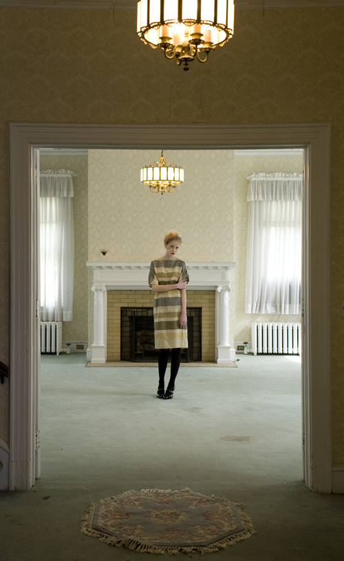
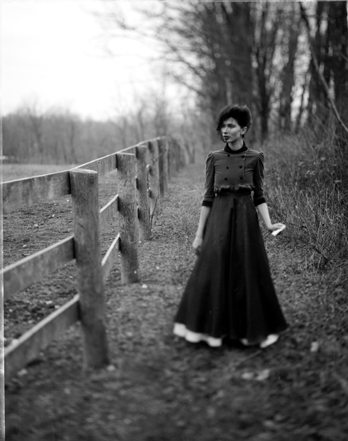
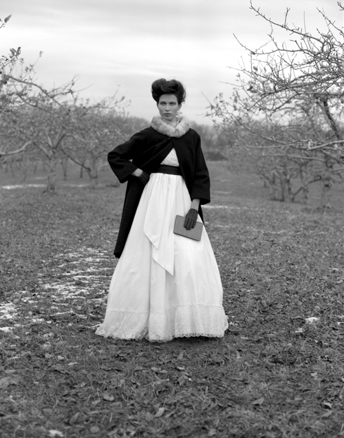
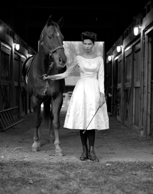
Three B/W Photos above: Andrew DeFrancesco
What do you think will be the next trend - seems all the rage is on food styling these days... I'm excited to see an emergence of "real life" incorporated into photography, be it with food, people, or a more casual approach to styling. I'm not sure if it's due to the economic downfall, Architectural Digest’s newly appointed Editor Margaret Russell’s quest to bring life back into the pages, or perhaps it seems fresh and current, but it's a challenge I'll gladly take on!
There are many ways to approach a styling job depending on the client. If it's a magazine, you need to plan ahead. For interiors, it's often very different with less preparation. What is the more challenging scenario? For most jobs I’ve found that the client usually sets the tone for the shoot. Whether the client is a publication, a design company or a “real” person, each job comes with a unique set of challenges and triumphs. Pulling items months in advance, unpacking, then packing them back up again is certainly a big task; you have to think about upcoming trends, upcoming seasons, and the date in which the project goes live… not to mention the labor involved with moving a bunch of boxes around! I think the most challenging jobs are those that require shooting in someone’s home. Whenever you enter someones personal space, there's a level of respect you must uphold -- it's a very vulnerable thing to let a team of people into your home. On these types of jobs, I think about how to best showcase the beauty of the space while also keeping in mind the specific requirements for the client, the whole time I’m aware that I’m also a guest in someone else’s home.
My job is to create a one-dimensional image for a photograph, and in many cases, I’m helping to tell a story through these images. It may be multi-layered or highly edited, but what may look like too much (or too little) in person comes across as a styled image ready to be captured by the camera. I often find myself educating the client about this process and instilling trust that my job is to make everything look good!
In these four photos below, can you explain the following:
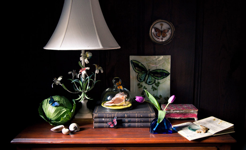 Image One: Photography By Jamie Beck
1. Why the cabbage? This image was part of a stylized editorial based on the Dutch still life paintings for Rue Magazine's Jan/Feb 2011 issue. These paintings depicted stylized vignettes of flowers, fruit, vegetables and bugs with the idea that all life has an ending and must go through a deodorization process. We shot at a beautiful and historic Estate in Rhinebeck New York that was built by Dutch immigrants in the late 1600's and the interior architecture and lighting had the same feeling as these paintings. I loved the idea of recreating this ripeness and replicating these Dutch Master's work in a modern way. 2. You have a lot going on but yet it doesn't feel cluttered - why is that? I think creating tightly stylized vignettes and overlapping objects helps to unify all the pieces. There’s also a visual flow to this image with the weight in the center (the stack of books) and lightness on all four corners: the lampshade, the highlight on the cabbage and shells, the open book and the framed butterfly. The repetition of color, white and cobalt blue, is also key in balancing the image. 3. Did you bring these props in or did you use what the homeowner had? Did the homeowner already have everything in place and you tweaked or did you create this look on your own? Many of the family's items were removed as the estate was up for sale, and except for a few larger pieces, most of the props were brought in. Because this shoot had a very distinct concept, each item needed to have a connection to these Dutch paintings.
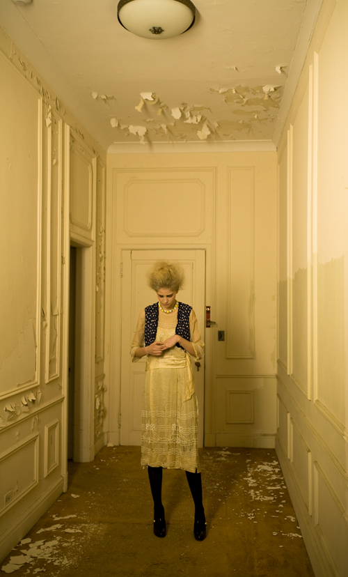
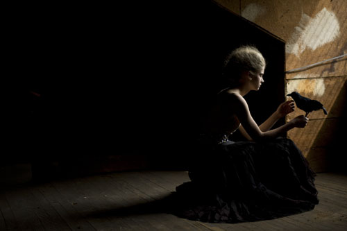 Image Two: Photography By Shanna Ravindra
1. What was this shoot for? The photographer had access to a dilapidated mansion on Long Island and the team was eager to shoot and then see what happens. We spent the day shooting all over the house and ended up creating some really beautiful work for our books. 2. What was the mood you were going for? The concept of the shoot was about a young girl who was trapped in this huge, run-down house, the state of the house consuming her. It was to feel mysterious, dark and a bit creepy. This specific shot was held in the attic that had beautiful light streaming in through the only window. I gave the model a fake crow to hold (one of my favorite Halloween props!) and there was a moment when she was adjusting the bird and then, boom, it all just worked.
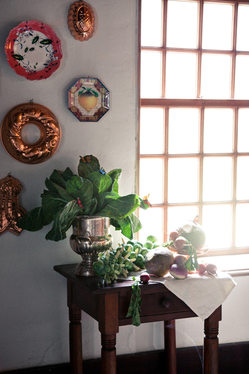
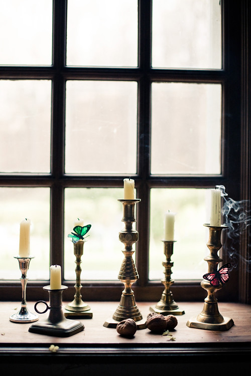 Image Three: Photography By Jamie Beck
1. I notice the same butterflies that you used in the first image - what is your thought on reusing props for the same shoot in different rooms? How can a props stylist reuse things without it being obvious? I think reusing props is fine if it continues the visual story of the shoot. The butterflies were part of the overall concept and using some of the same elements for each shot allowed for an overall consistency. In a more abstract way, these butterflies could have easily "flown" into each of the shots, where something inanimate like a pillow or book should probably remain in one set-up or it may seem like the stylist ran out of props to use. 2. When photographing candles, wicks used or new? I say used but I've seen some stylists use new ones. I like to use old wicks, or at least burn them for a bit to look used. Even if you never use the candles and they're only for display, burning them adds an understated elegance to a room. 3. What was the mood you were going for with this windowsill still life? There's a quiet sensibility in this photo, a feeling of a world gone by. The whole shoot had this feeling, similar to the paintings that inspired the shoot. I also wanted to highlight the deep windowsills indicative to an old Dutch house.
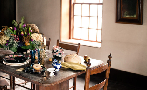 Image Four: Photography By Jamie Beck
1. What mood were you going for - I love all of the things that you've used! Thank you! It was a lot of Anthropologie pieces mixed in with vintage. When styling Tableau's I love the messy yet an artfully arranged composition and wanted this shot to feel casual yet elegant. The light pouring in through the window illuminated each object with the shiny pieces seeming to pop off the rustic wooden table. 2. Did you make the veggie arrangement and if so, do you have tips on using cabbage indoors? As this shoot was inspired by the Dutch still life paintings, I wanted to create a modern take on the flower arrangements that were so often painted. I stuck dowels in the vegetables and used dried hydrangeas and herbs that I imagine would be in a Dutch home circa the 1600's. I added some tulips and of course, a few little butterflies! I was constantly spritzing this arrangement throughout the shoot with water to keep it fresh, although I don't know how much longer it would have lasted beyond shooting. The elements of life depicted in these paintings were symbolic of fleeting beauty and I wanted this arrangement to look almost "too" ripe.
Wow Meagan, this has been a most inspiring interview for me and I'm sure decor8 readers have loved getting inside of your head for a bit. Thank you so much for being very generous with your explanations -- you explained something that can sometimes be a very hard subject to explain, so well.
(images: andrew defrancesco, jamie beck and shanna ravindra.)
