9 New Colors From Farrow + Ball
Hello everyone! I have so much to tell you about... I've just returned from 5 days in Paris, then I was home for 3 days to be with my little boy, then I spent 8 nights in London. What a whirlwind adventure. It was all for work, though I had plenty of fun, so you can only imagine the overwhelming amount of inspiration that I picked up along the way. I want to share a special visit to Farrow & Ball that I had last week when I toured their factory and headquarters in southwest England, but first, I simply must share their 9 new colors for 2016 while I'm working on the factory tour post. I saw the new colors actually being made and they are gorgeous. Meeting with Creative Director, Charlie Crosby, discussing the process of color naming and development was just fascinating, too. It was great to be in the factory experiencing the process from beginning to end for both wallpaper and paint, and to chat with the color lab guys to learn how extremely dedicated they are to each and every can of paint being made so that it is just perfect. Want to see the new colors? I'm sure you'll love them. I'll tell you my favorites below... 
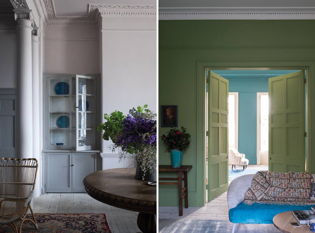
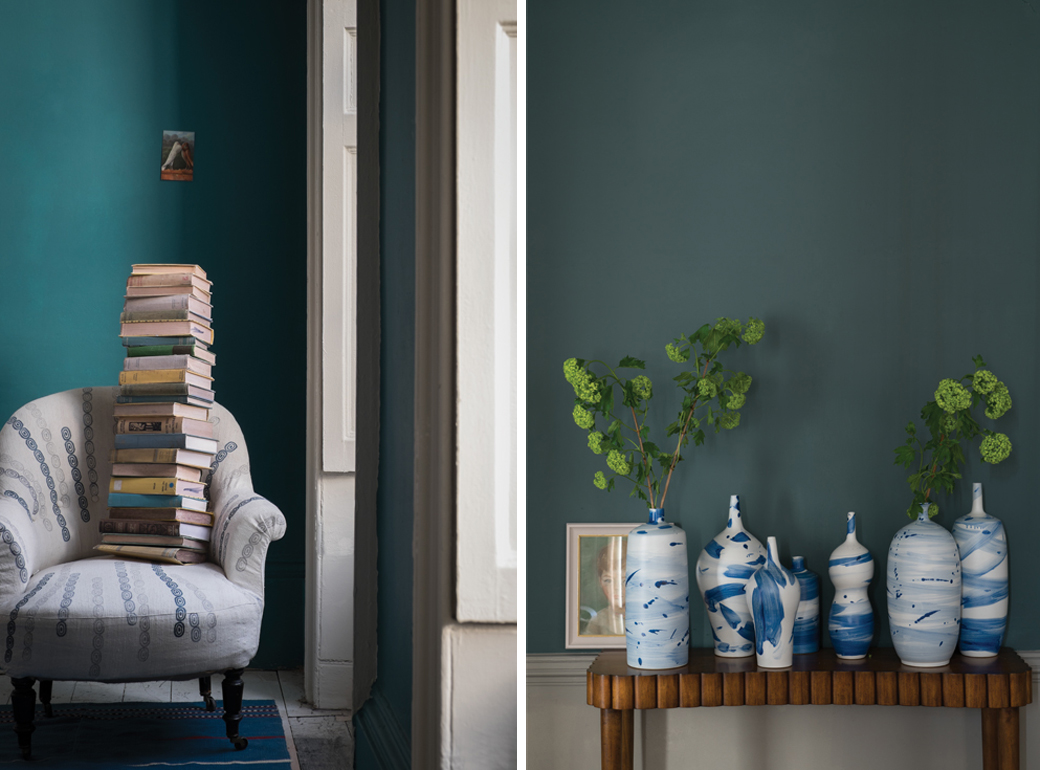
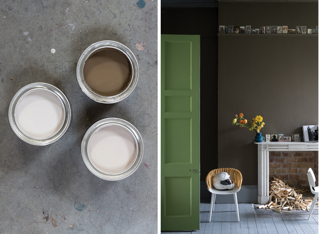
Left: Shadow White, "Shadow White is the lighter version of Shaded White so the two are linked and work perfectly together. Both names are taken from the soft tone created when whites are covered in a deep shade." It has a shaded feeling when used in south facing rooms. // Right: Drop Cloth, "We’ve named this colour Drop Cloth in honour of all the painters and decorators who have worked with Farrow & Ball paints for so long, as it’s the traditional name for a dust sheet. The colour has a subtle touch of mystery about it." Great choice for east facing rooms because it appears strong in the morning and more muted as the day progresses.

Left: Worsted, "Taking its name from city suiting often made from flat woven fabric, and the sleepy Norfolk village where the yarn was originally created." Looks strong and gritty in north facing rooms which can be super moody and fantastic. // Right: Cromarty, "The Shipping Forecast is very much part of the fabric of British life – warning all sailors about impending gales and wind. Cromarty’s name is taken from the Cromarty Firth estuary and conjures up visions of swirling mists." Color changes from blue to neutrals in west facing rooms, a nice choice there.

Left: Peignoir, "Chemise, Blazer and Babouche are all names of colours in our paint palette that have been inspired by pieces of clothing. So with that in mind, Peignoir is named after the sheer floaty garment traditionally worn by ladies while brushing their hair in the mid-20th century, perfectly summing up the romance of this hazy grey-pink." Suggested to pair with all white in south facing rooms for a contemporary and clean look. // Right: Yeabridge Green, "This colour was found at Yeabridge House, an 18th century Georgian Hamstone farmhouse, when the original gun cupboard was removed. This vibrant verdant green had laid untouched for many years but was amazingly still reminiscent of the lush Somerset grass that surrounds the house." Looks great in rooms with northern lighting.

Left: Vardo "A Vardo is a traditional horse drawn gypsy or Romany wagon. A similar colour was used in the intricate patterning of these showmen’s vehicles (usually over red) which is seen as an important cultural high point in decoration during the mid-19th century." Suggested for pairing with white and for using in west-facing rooms. // Right: Inchyra Blue, "This is inspired by a bespoke colour made for Lord & Lady Inchyra at beautiful classic Georgian Inchyra House in Scotland. Inchyra Blue is used on the exterior doors of their very impressive byre (or barn) which was restored in 2013. It nestles at the bottom of a rather grey and imposing brae (or hill) so needed to have a depth to it but also be sympathetic to its dramatic backdrop and work with the moody Scottish skies." Looks best in west facing rooms.

Both: Salon Drab, "Room names have always proven to be popular choice for us and the use of the word Salon not only refers to the small outer room of a drawing room but also conjures up a cultural, intellectual conversational hub. A two-part name, combining Salon, the small outer room off a drawing room, with Drab, a term favoured by true colourists, which simply describes a colour as lacking in brightness." It is suggested to use this color for darker north facing rooms to make them feel more cozy.
My favorite is Vardo. Their collection really need a teal and it's such a great color for those who love the strength of Arsenic but want less green and more blue. Vardo is gorgeous. I also love Salon Drab because it's the perfect brown. Brown can be SO WRONG but this brown is SO RIGHT. It's exactly the brown I saw a lot in Paris and it looks great with tons of artwork displayed against it. Worsted is the perfect gray. It's not too light and not too dark, it's perfectly in the middle. Cromarty is another color I like because it's so fresh and summery. It reminds me of my childhood days at the beach.
What about you, any color favorites from what I've shown above?
I can't wait to share the Farrow & Ball factory tour with you tomorrow. Stay tuned!
(Photography: Farrow & Ball)