
A Passion for Purple
I never thought I'd type those words, A Passion for Purple. But the more I think about purple, the more I've noticed it over the past few days. My perfume, Jette By Night from Joop is in a gorgeous purple glass bottle. Some of my Mac eyeshadow is in plum or lavender. A sweater purchased at Noa Noa last Fall is a deep plum. I do have purple in my life! Even as I sat in the local Starbucks last night, I caught glimpses of it scattered around me. The hoodie on a teenage girl. Boxes of expresso machines in lilac piled nearby. Mugs leftover from Easter. Even some of the designs on their products incorporated the very color I assumed I disliked. Over the past 24 hours, have you 'noticed' purple a little more? It's actually quite fun to single out a hue and try to spot it around you, observe how it's used -- the various shades, how much/little, and the colors that it's displayed with. Try this today and see what I mean. To get you started, here are some inspiring images for you...
 I love this mail order company in Germany, Impressionen. I stock up whenever I'm over there. They have great prices, too.
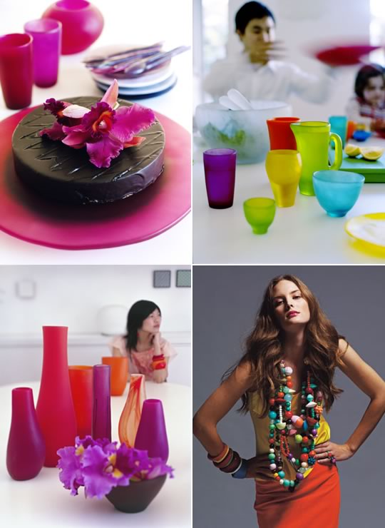 When I think of deep shades of purple, cups and plates from Aussie design studio Dinosaur Designs comes to mind. Don't you love how the color looks with other saturated hues? It looks very crisp and modern.
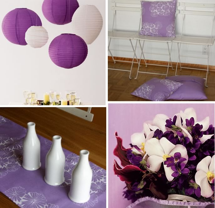 Henry Road carries a few pillows in purple along with a table runner, and many Brides carry flowers in various shades, from orchids to violets.
 Living Etc. has a great online gallery, if you haven't checked it out before, hop on over there and see how many rooms with purple you can spot. I like how this bathroom used various shades of purple and red in the tile work, and then as a subtle accent, purple tulips on the sink and a purple towel. Nice!
 Living At Home is a German magazine that I read, well try to read, as my German is still a work in progress. But whenever I think of this magazine, I see orange, blue, red, and purple. Seems Germans aren't afraid of using primary colors in the home, like blue. When I lived in Germany while dating my husband, I couldn't handle all of saturated color in homes there, it drove me absolutely insane because back then, I only saw crayola colors in a kids room. Over the years, I started to appreciate fully saturated colors in decor much more through travel, blogs, magazines, books... And I'm not put off by it in the least.
 More beauty again from the online galleries of Living Etc. When I see spaces like this, I always think about the person that lives there, why they've styled things a certain why, and in this case, why purple was their color of choice. It's fascinating to learn about the associations that others have when it comes to color.
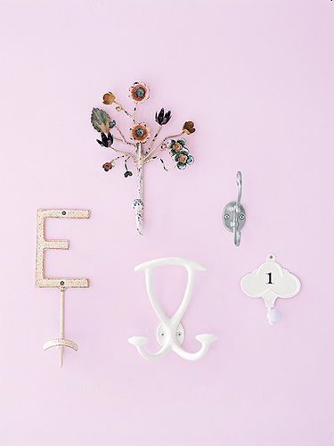 Real Simple shows us how to arrange multiple hooks against a wall that looks somewhat purple, at least on my monitor. Purple can lean in so many directions, and depending on lighting, can look almost pink, blue, grey, or cobalt at times.
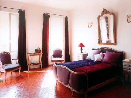
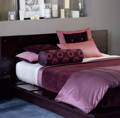 More treasure to look upon from Living Etc. Very sensual, especially seeing plum in silk and velvet mingled with dark, rich wood tones. This is very contemporary and peaceful, welcoming.
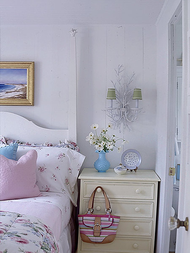 Country Home is another website to visit for color inspiration, since those who lean towards its laid back style tend to incorporate lots of lavender and lilac in their decor. Of course, always alongside other pastels, and always in florals and stripes, as this creates the charm that embodies this style.
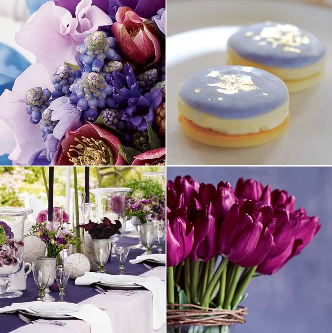 Brides is a great website to cruise for color. Aren't these arrangements stunning? I think every Bride wants to have a second wedding just to recreate the magic all over again.