
Lavender Love from The Washington Post
Leah Hennen, a fellow freelance writer (she has all the big guns like Real Simple, The New York Times, HGTV.com, Health magazine, and now, her own blog, More Ways to Waste Time on her resume), shared The Washington Post series on lavender today. Quite exciting -- more design inspiration if you're looking to add a little lavender love into your life. Seems others are turning their attention towards this color so the timing on this is perfect. The four articles are linked below from The Washington Post. Enjoy!
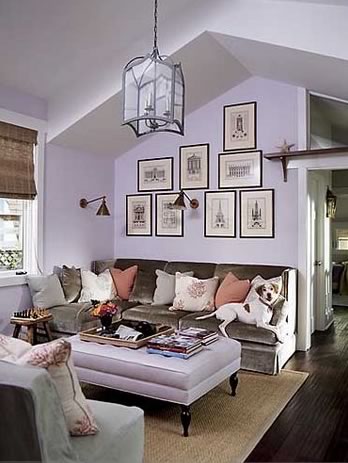 "Lavender, Neutralized" discusses how lavender can be a "soft and embracing neutral". Side point: Is the dog on the sofa not the most overly used, yet utterly charming, accent in home decor photos? It's almost like dogs are cooler than kids, more hip. If someone flips open their wallet to show their grinning kids, the "friend" usually forces themselves to show interest and politely looks at them. They're totally hiding the "whatever" look and famous eye roll, pretending that your smiling son is the cutest thing alive. Whip out photos of your new dog, and the whole office forms a line at your desk, requesting you bring in more photos, or better yet, the whole dog. Back to my point. Dogs in photos. Kids in photos completely bombs unless you are selling products for kids. Dogs in photos always work whether you are selling a sleek Italian sofa or an oil tanker. But I digress... Just a 'trend' I'm seeing with dogs in photos.
 "How They Make the Most of Lavender" (expert advice on using the color). Good article, check it out.
 "The Experts' Specific Picks": This article features fave paint hues from design experts. I'll add my voice here, as I have my opinions on the subject, too. Ahem. My favorite purples from Mr. Ben Moore are Violet Mist (greyish), Whispering Wind (heavenly, soft purple), and Irises (if you are looking for a deep, dark purple that almost reads as a charcoal grey in certain light).
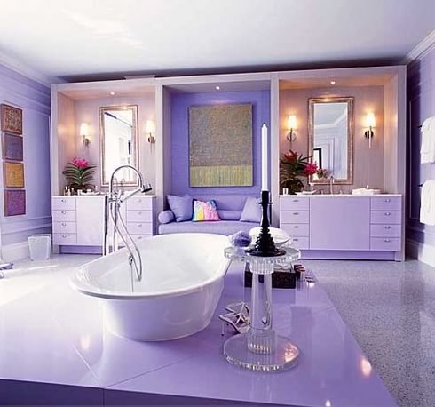
 And finally, a photo gallery over at The Post showcasing lovely lavender interiors. Like some of these photos I've included in this very post.
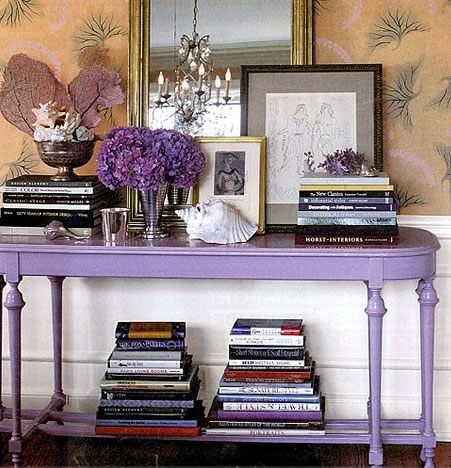 I absolutely adore this image. Delish! A purple table for the entry. What a statement. Despite how perfectly stylized things are (shell artfully arranged on (or near as in this case) a book, Nate Berkus and Oprah would grin and the audience would clap at this one, especially Miss Beckster), I think the homeowner sincerely hopes you'll see that they're really a fun bunch behind all the OCD perfection. They're secretly praying that when you enter their home, that purple table will show off their amazing taste, perky personality, and their ability to read books.
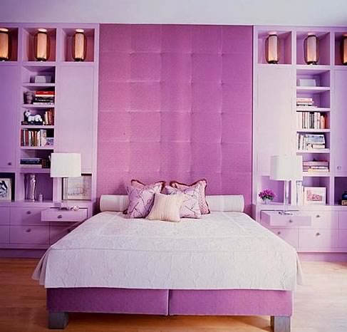 Ah. One can only look and admire the perfect placement of every single item. Thankfully, the white coverlet gave this room the grown up feel that it would not have had if the designer added a pattern on this bed. As is, the room is absolutely serene and very, what would that girl on Top Design say, Glamtastic? Or was it Glamalicious? Glammaramma ding dong? :)
Okay, so I think we can call it quits on Purple. I need a break. I think I'll go back to the regularly scheduled program here on decor8. Hope you had fun with this because the goal here was to break the mold and for some (---->me< ----), position purple in a more positive light. I'm cured, what about you?
Thank you Leah for the GREAT tip!
(all images from the washington post)