Trends: Maison&Objet Fall 2013
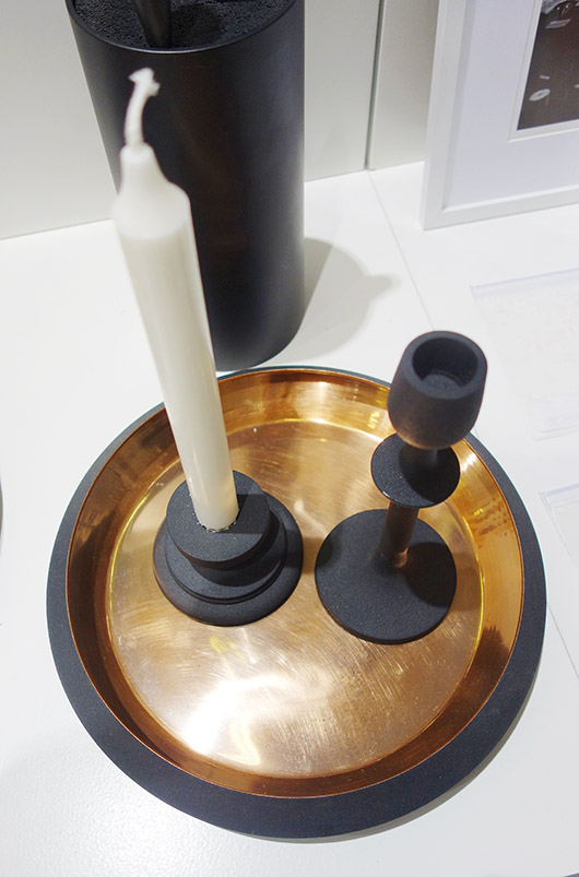
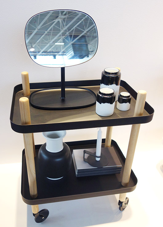
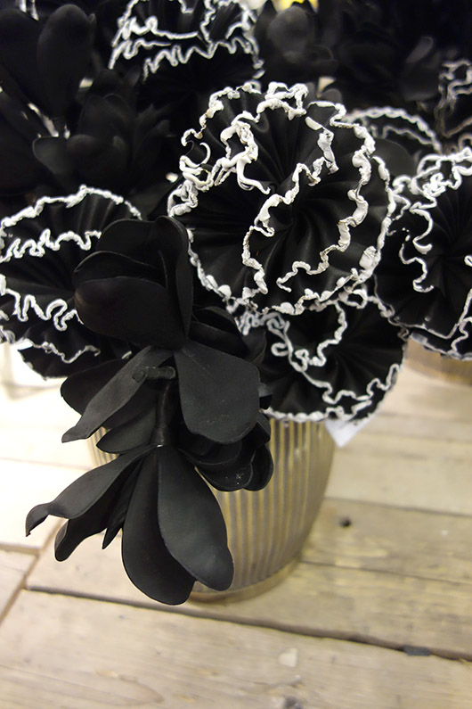
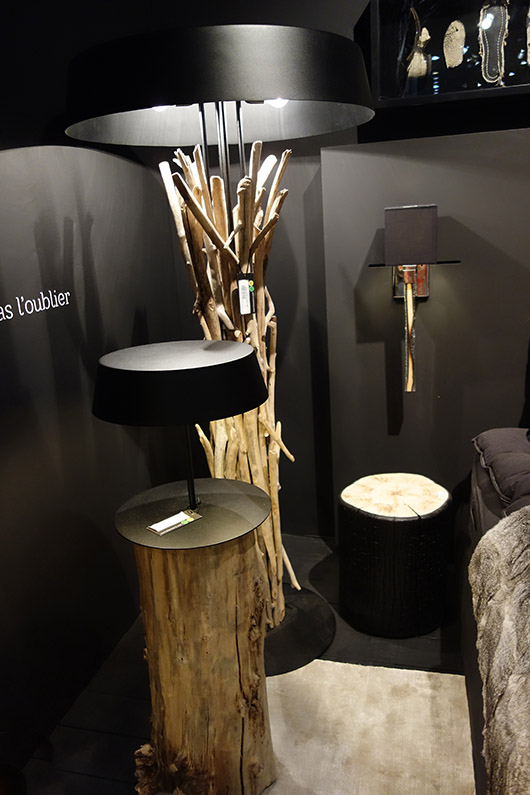
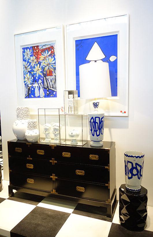
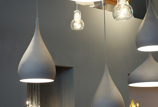
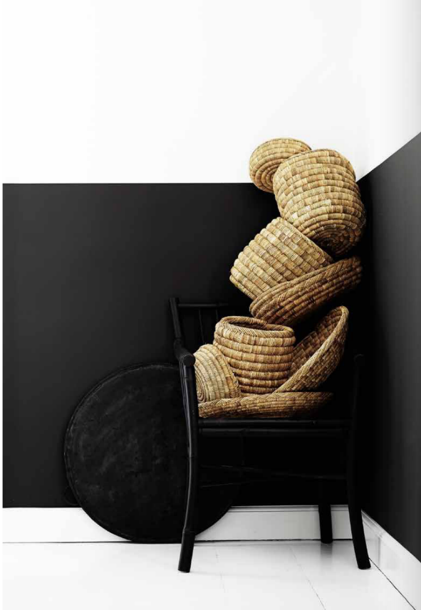
Hi everyone, are you ready for a new trend report on the Maison&Objet show in Paris that I attended a few days ago? Funny thing is, and don't let this discourage you, but there are not that many striking new trends right now! You might find a new colour or a different combination of colours in one product range, but nothing unusual. For metals, copper is still hot and since we have seen and talked about copper a lot, I have skipped metallics for this report. The brands at this show basically offer what they have tested in the past month to be accessible for the final consumer relying on their catalog and on recent bestsellers. Even still, with 9 huge pavilions there was a lot to see at Maison&Objet and I returned home to Barcelona feeling very inspired! I highly recommend this show - the next ones will be held in January and again in September of 2014. Color Trends BLACK IS STILL TRENDING Black is an evergreen color, in some markets such as in the Scandinavian countries more than in others but yes, there is a common trend back to dark greys such as kohl and black. You will find black as an accent color or total look on accessories and outdoor furniture turned into indoor pieces (Sika Design). Or you’ll find black mostly combined with metallics (copper and gold) and/or white, and any material goes: wood, resin, glass, ceramics, textiles, etc. Walls are painted black again.
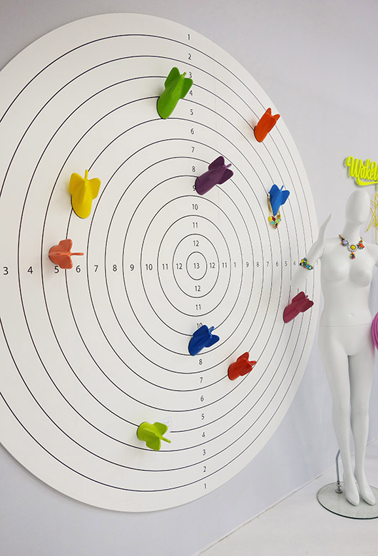
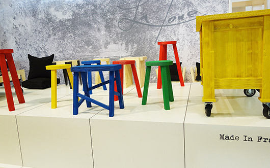
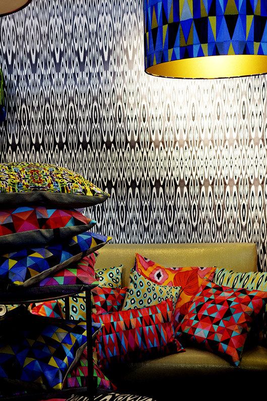
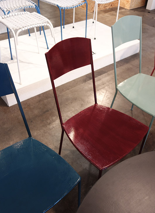
BRIGHT PRIMARY COLORS Bright colours are linked to geometric patterns and strong graphics. Black and white underline its boldness and play on patterns like grids and checkerboard many times. Red, blue, yellow, green and orange are still a big hit in interior design for accent pieces but look also for packaging, tableware, consumer electronics and graphic design.
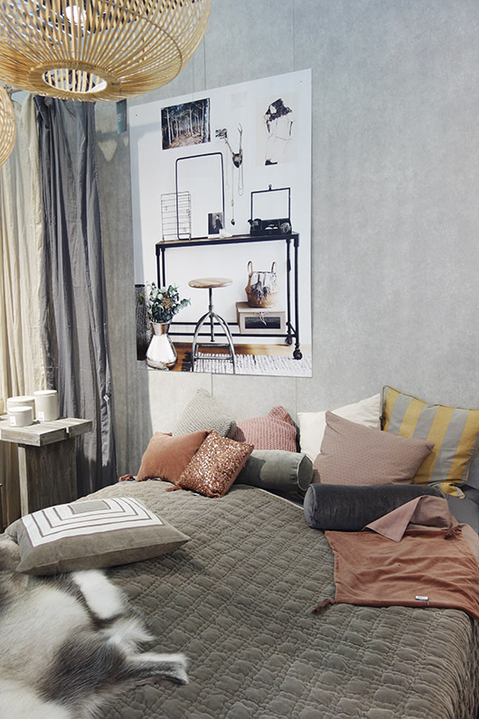
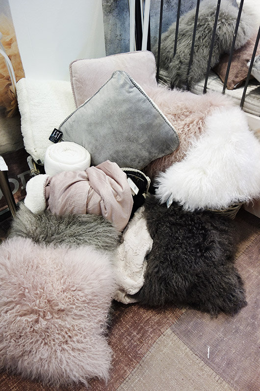
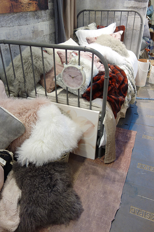
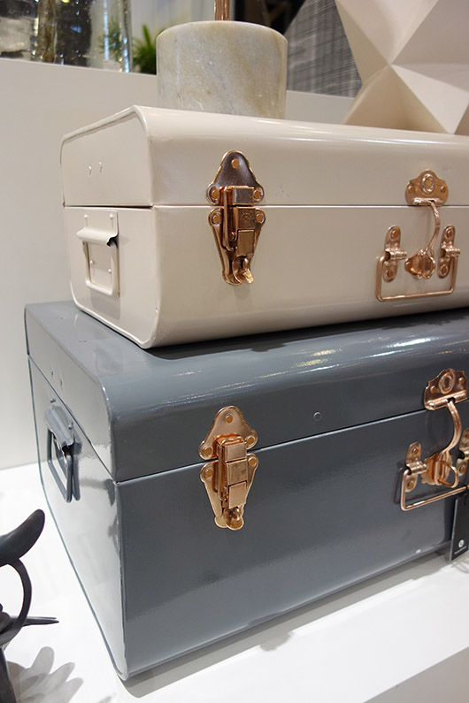
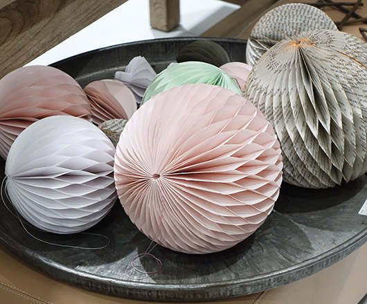
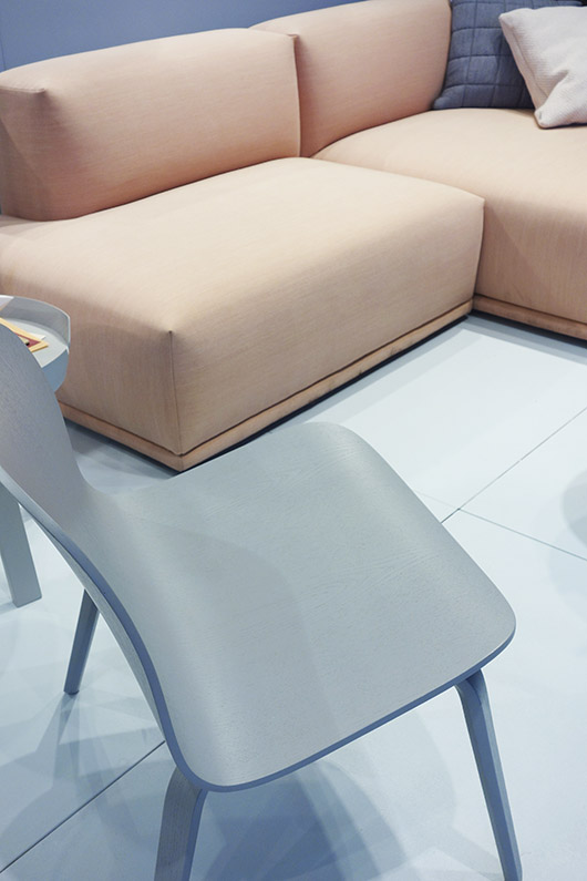
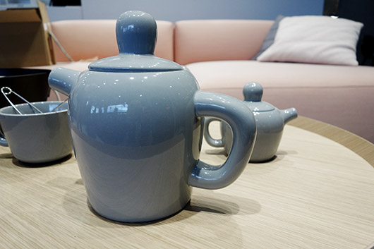
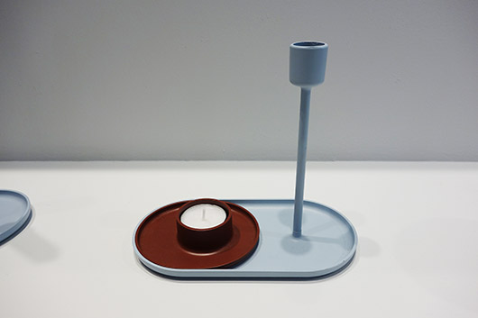
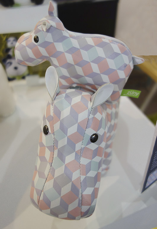
PASTELS + GREY Pastels, mainly in combination with powder shades become more serious. Or shall I say less feminine? Pearl grey, slate grey and even kohl are the new partners to combine with. It gets cooler and all shades of grey play a major role again in the interior world. It is understated, sophisticated and most interesting when metals such as copper get into the mix. I think the new pastel + grey combo is truly elegant and perfect for the season to come!
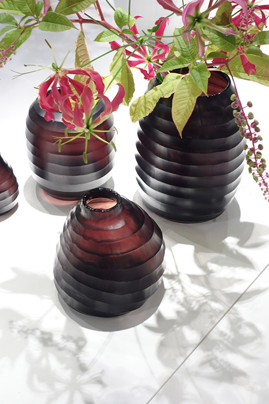
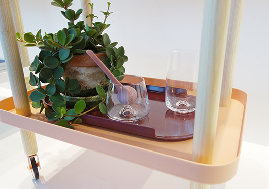
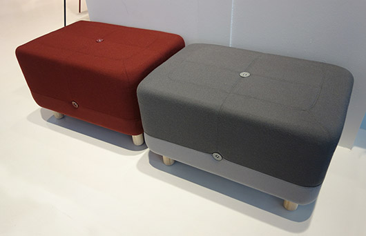
BURGUNDY Do you recall the shy appearance of the new terracotta colour from my visit to the Milan Show Il Salone in Spring? Well, there is a similar novelty now. Burgundy has been spotted on the catwalks last Fall/Winter 2012/13 and is now hitting fashion stores this year. Since fashion and interiors merge with an awesome velocity for the past two years, we already have seen a few nice examples of the colour to come. Are you ready to embrace the wine-soaked color trend?
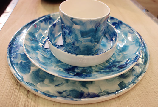
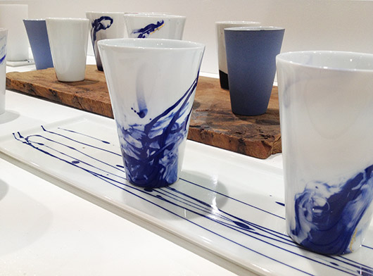
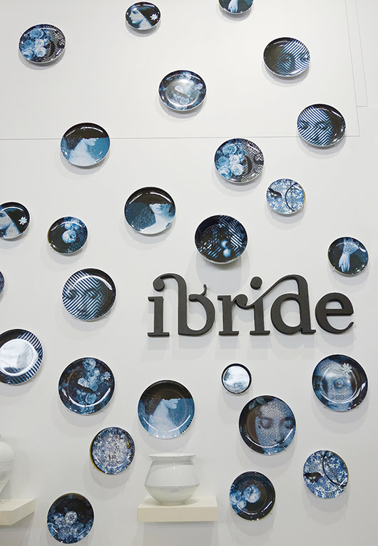
Accessories INKED CERAMICS Ink stains and/or watercolour effects on ceramics are one of the hottest trends of the season. The clash of mostly blue hues is intense and resembling illustrators’ work. Watercolours have been around quite some time now in fashion, stationary design, packaging, web design and textiles. As for tableware, watercolours or ink stain effects seem to be most effective when used with ‘less is more’ and reduced to a few colour shades.
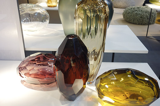
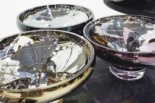
METALLIC EFFECTS Shiny metallic reflections on glass is one of the latest innovations capturing light and creating stunning mirror effects. Glass design is exploring new fields in colour, shape, mixed materials and finishings. The An&Angel collection has been awarded for High Design Quality with the “Red Dot Award Product Design 2013”. There has never been such a variety and even not spotted at the M&O since I visited an excellent exhibition of Werner Aisslinger in Berlin) this past Spring and would like to add an extra image of his Mesh Vases since they fit perfectly here.
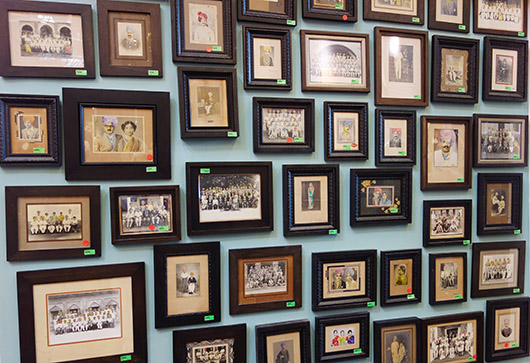
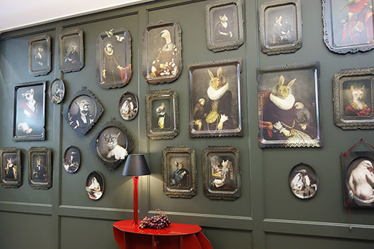
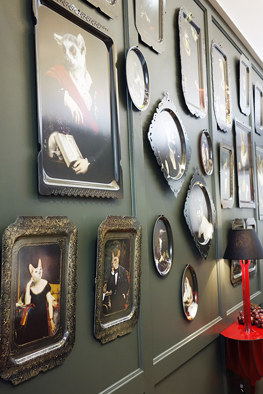
WALL WONDERS Clustered framing is not new but what caught my eye is the tendency of hanging similar pieces with almost no or few space in between. Trays, plates, frames – there is no limit. It is not about preserving a memory with photos or to hang art on your wall but to decorate the wall with anything collectable.
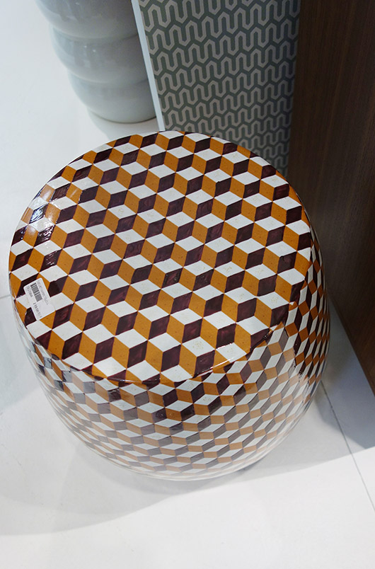
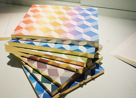
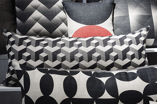
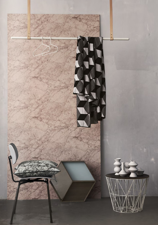
ESCHER PRINTS I am happy to see one of the many Escher prints back. I have always been a fan of his work. The classic black and white is the most applied and recognized pattern but there where some color pops too.
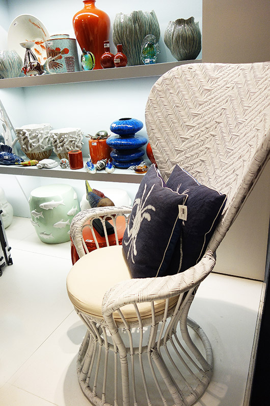
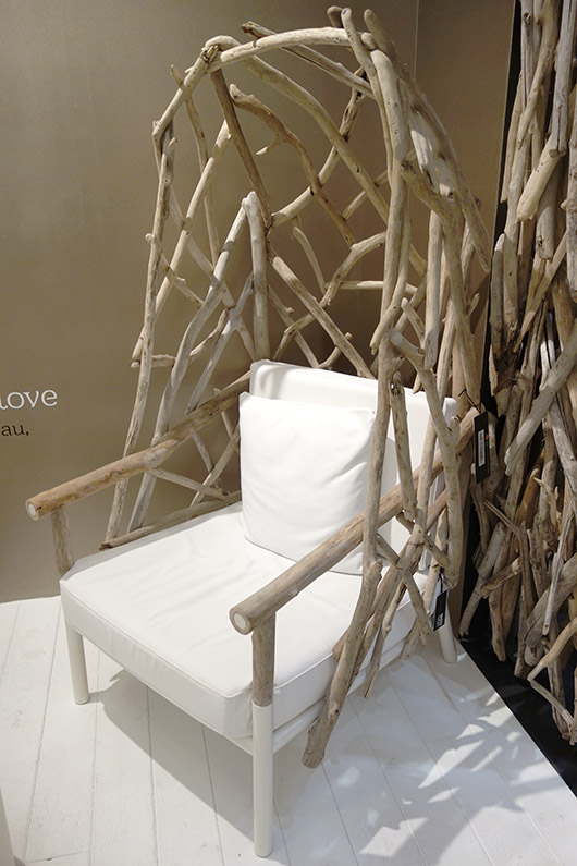
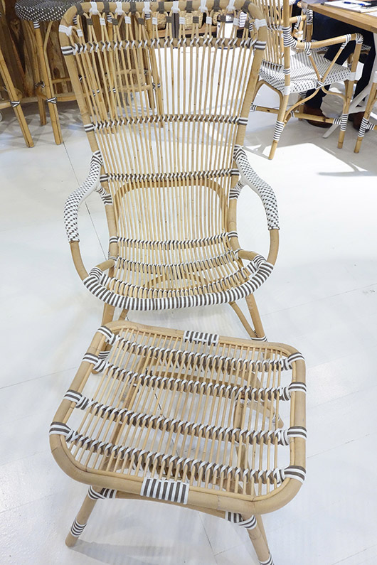
Materials WICKER, WOOD, BAMBOO CHAIRS There is a throwback to the Emmanuelle armchair with the oval back rest and peacock pattern! Whenever I visit our local flea market here in Barcelona I am looking for a reinterpreted object or the original itself! But there are many other wicker and rattan armchairs now edited without compromising the spirit of the original design. The most characteristic feature is the very high back rest.
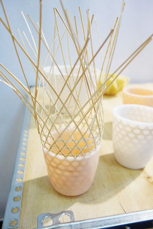
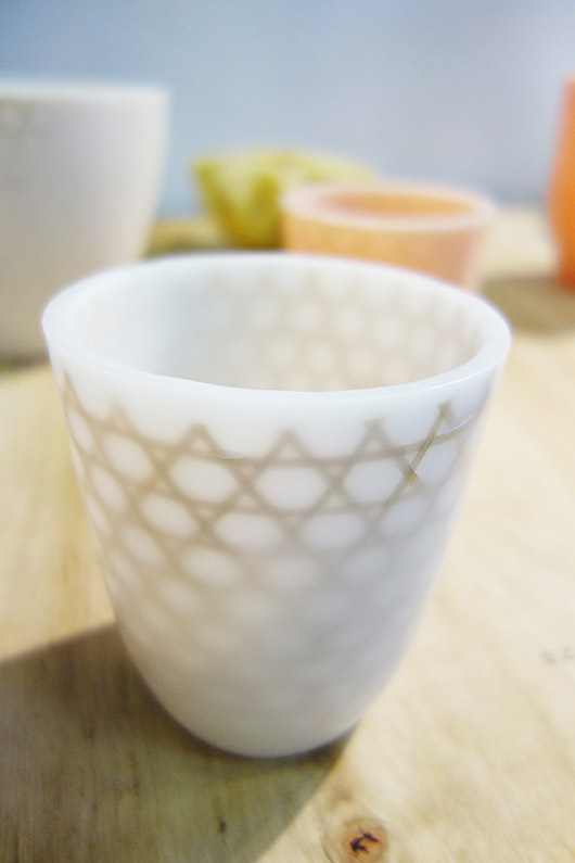
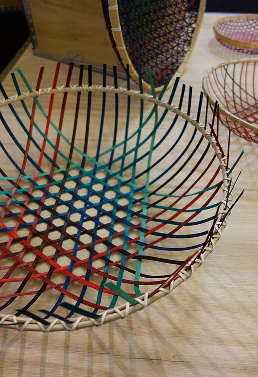
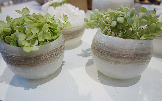
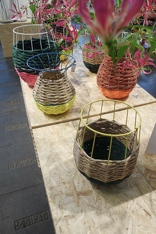
NATURAL FIBER CONTAINERS Everything related to weaving, space-dyed knitting and natural fibers is the biggest trend right now. Due to the growing number of aficionados, new colours and materials are now combined mixing fabric structures with glass, wax, polyethylene, etc. Natural earthy colours are still the most popular but colourful fibers are expected to grow soon. Plus, there is a lot of black now too. This interior throw-back look is back and very popular again! Basket weaving is applied for different types of containers used for several purposes. In the process of weaving vegetable fibers, new materials such as wax or metal structures can be integrated giving a modern look and new style credentials.
I’d love to hear your comments on those trends. Is there anything special that caught your eye and if so, why? Have a wonderful day and enjoy the upcoming weekend!
(text/images: gudy herder, ferm living, tinekhome, editing: holly becker)


